Complete Website Refresh in 15 Days
SpinePro Case Study
Technical modernisation, design and content overhaul, and technical SEO foundations for a UK spinal surgery business.
SpinePro were referred to me after their relationship with their previous digital agency had broken down. The website was underperforming, load times were poor, and the UX was confusing potential patients.
After months of slow progress, they needed someone who could turn things around quickly. The new site went live two weeks later.
James proved to be extremely capable, responsive, knowledgeable and genuinely invested in the success of the project.
Before
After

What I inherited
The codebase had accumulated years of technical debt. It was built on frameworks that were several major versions out of date, causing compatibility issues with modern hosting environments.
More problematic were the architectural choices that had seemed clever at the time but created ongoing headaches, for example, spacing and typography systems that produced different results at every screen width, making the site nearly impossible to test systematically or maintain consistently.
Around 25 plugins were installed, most attempting to fix performance problems they were collectively making worse.
The site was built on an old version of Sage 9, Tailwind CSS v1, and the Stylus CSS preprocessor. The Sage version was causing compatibility issues with PHP 8, which was breaking many parts of the WordPress admin interface.
The spacing system used viewport-width (vw) units throughout, meaning padding and margins scaled continuously with screen width rather than snapping to predictable values at breakpoints. This was a brief trend in web development around 2018-2019, but it’s now generally considered bad practice – it makes designs unpredictable and testing more time consuming, as well as impacting accessibility by interfering with page zoom. The typography system went further: the root font size was redefined at four different breakpoints, so every rem-based value on the site would shift at those thresholds.
Around 25 plugins were installed, the majority performance-related: multiple caching plugins, image optimisation plugins, lazy loading plugins, and render-blocking resource handlers. One optimisation attempt had inlined approximately 80KB of CSS directly into the HTML document head- likely worsening page load time rather than improving it, since the HTML itself became the bottleneck and the CSS could no longer be cached separately by browsers.
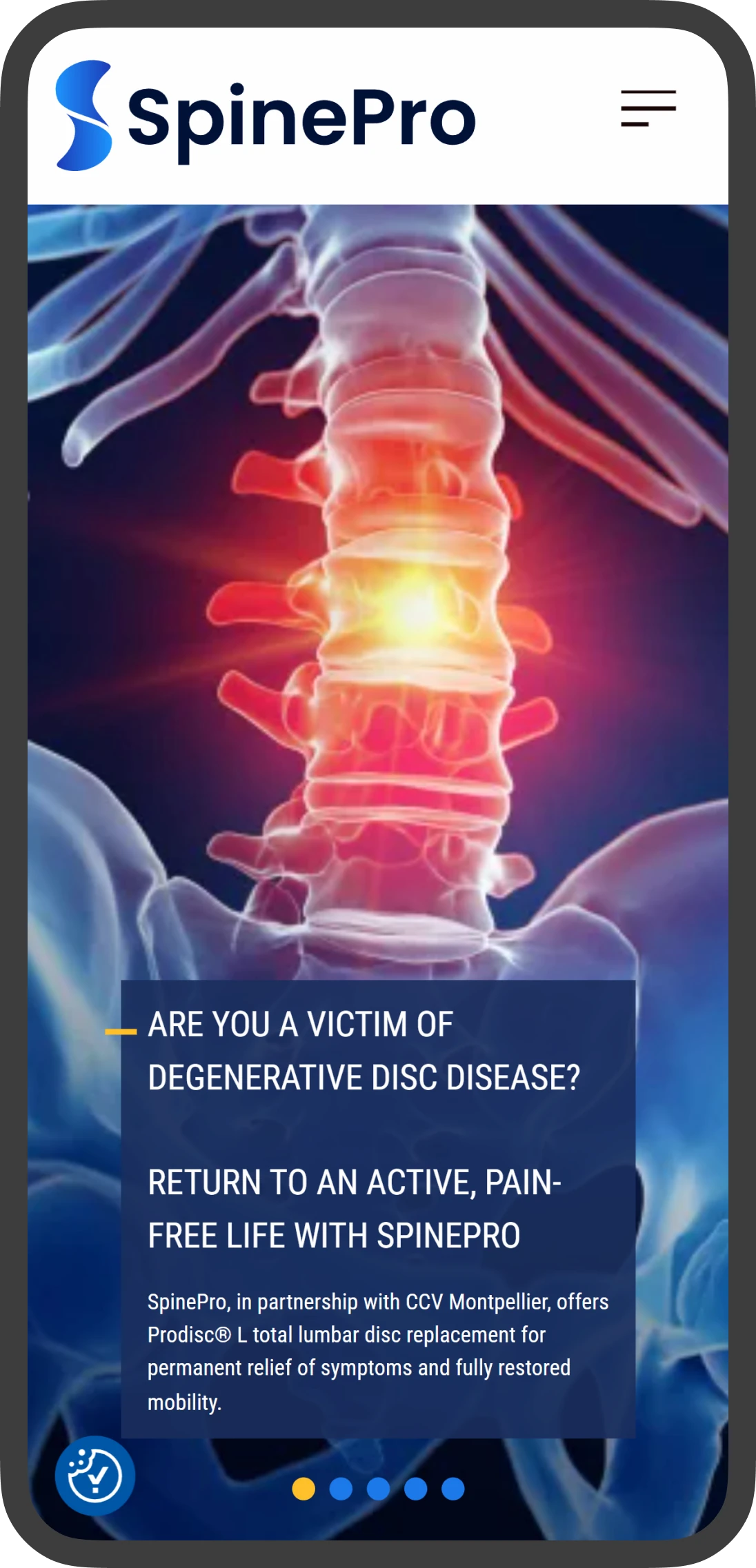
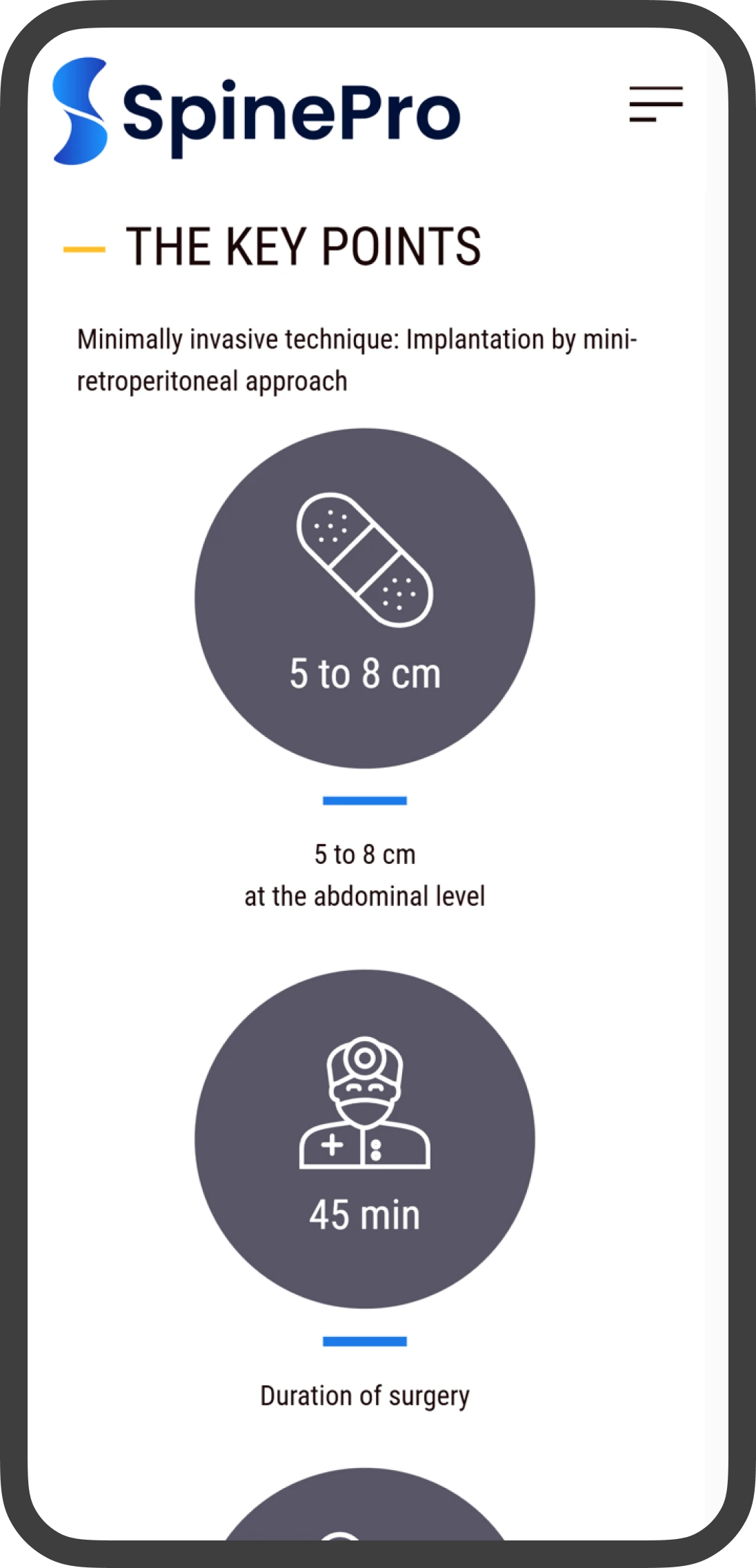
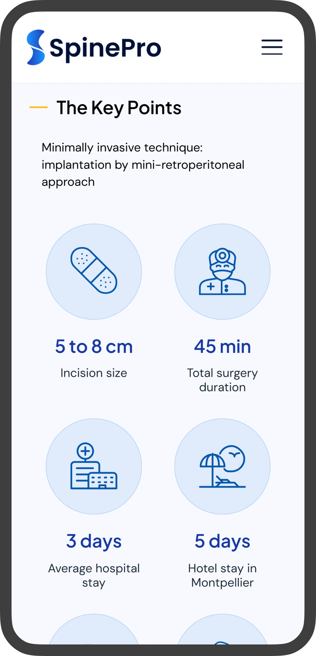
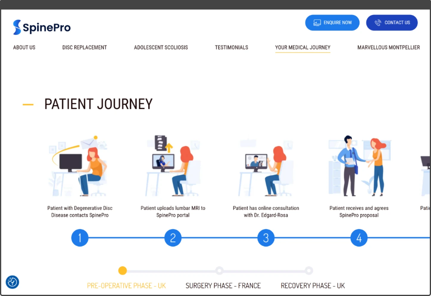
The user experience had similar issues. Key information was hidden in homepage sliders that most users would never click through. The patient journey was buried in a 16-step horizontal slider that moved as the user moved their mouse cursor and was fiddly and often led to poor performance on some devices.
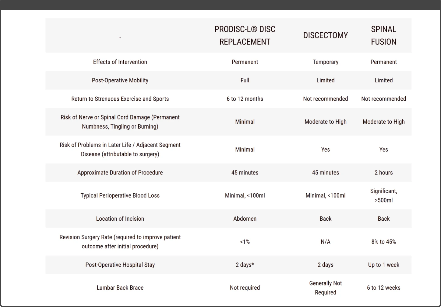
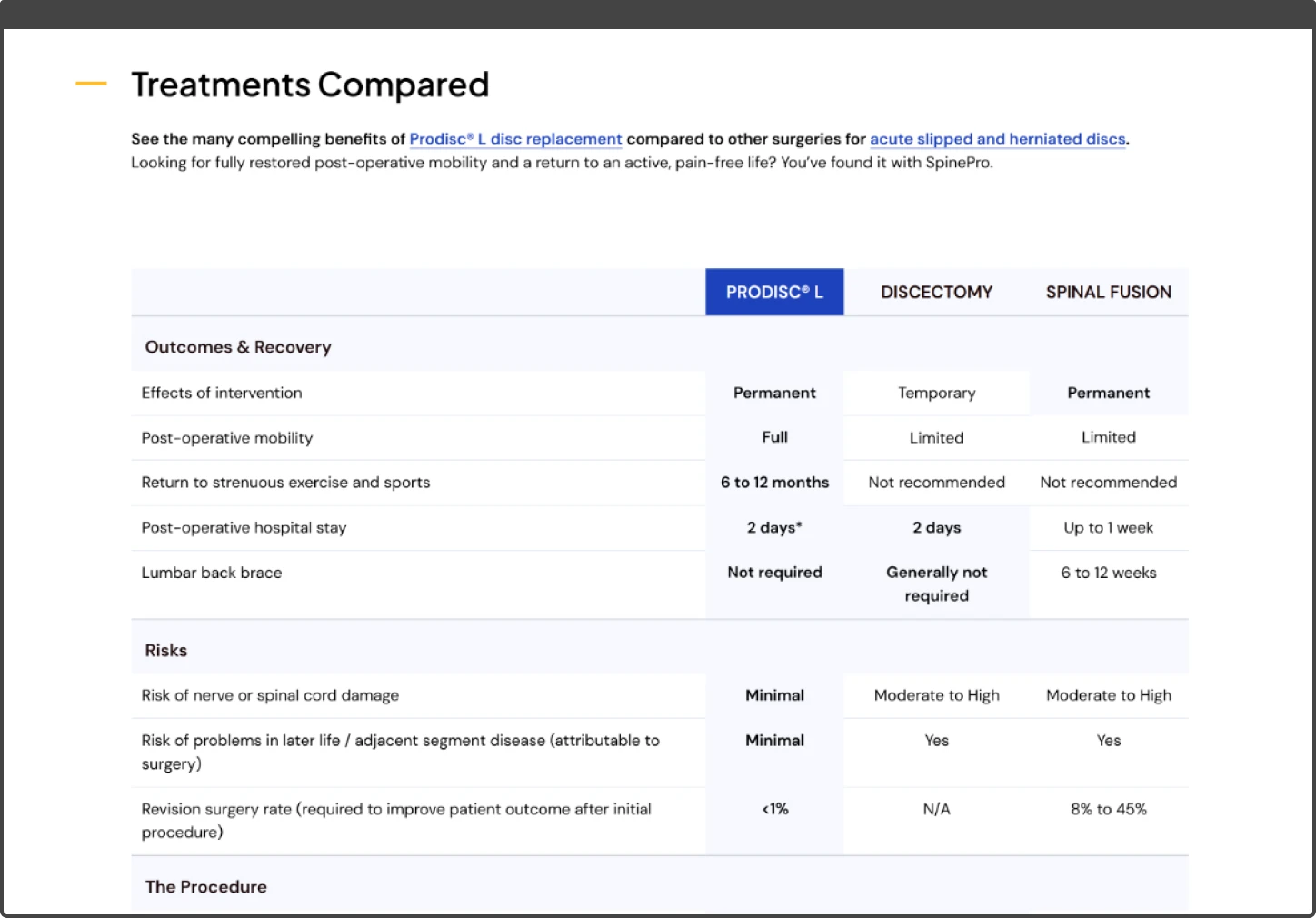
The comparison tables, which should have helped patients understand their options at a glance, were difficult to scan.
The SEO fundamentals weren’t in place, such as URLs unrelated to page content and metadata that didn’t reflect what was on each page.
Before
After
What I did
Technical
I started with the technical foundations, not because code quality is an end in itself, but because the existing setup would have made every subsequent change slower and more error-prone.
I migrated to current framework versions, replaced the unpredictable spacing and typography systems with consistent design tokens, and cut the plugin count in half. This took around 10-15 hours upfront but paid for itself over the course of the project.
I migrated the theme to Sage 11, updated to Tailwind v4, and replaced Stylus with modern CSS. This wasn’t about chasing new tools for their own sake: Sage 11 works properly with current PHP versions, Tailwind v4 has significantly more useful features, and modern CSS now handles things like nesting, variables, and grid layouts that previously required preprocessors.
I replaced the vw-based spacing system with fixed spacing values using Tailwind’s design tokens, applied at standard breakpoints. This means an element with a certain padding has that exact padding across a range of screen sizes, then steps to a different value at the next breakpoint – predictable, testable, and matching design intentions exactly. I did the same for typography: font sizes step cleanly at breakpoints, and the root font size is no longer overridden, meaning it inherits from browser settings. This matters for accessibility – users who’ve increased their default font size for readability will see that preference respected.
The plugin audit removed 13 plugins. Most were performance-related tools collectively creating more overhead than they solved: multiple caching layers that conflicted, image optimisers running redundantly, and lazy loading implementations that clashed with the theme’s own. The remaining 12 plugins each serve a distinct purpose without overlap. The CSS went back into external stylesheets with proper cache headers; better for returning visitors, easier to debug, and with no detriment to performance.
I also rebuilt several of the custom blocks rather than patching the existing ones. The new ones use native browser features where possible: native lazy loading via the loading="lazy" attribute, responsive images via srcset and sizes attributes, and modern CSS layout.
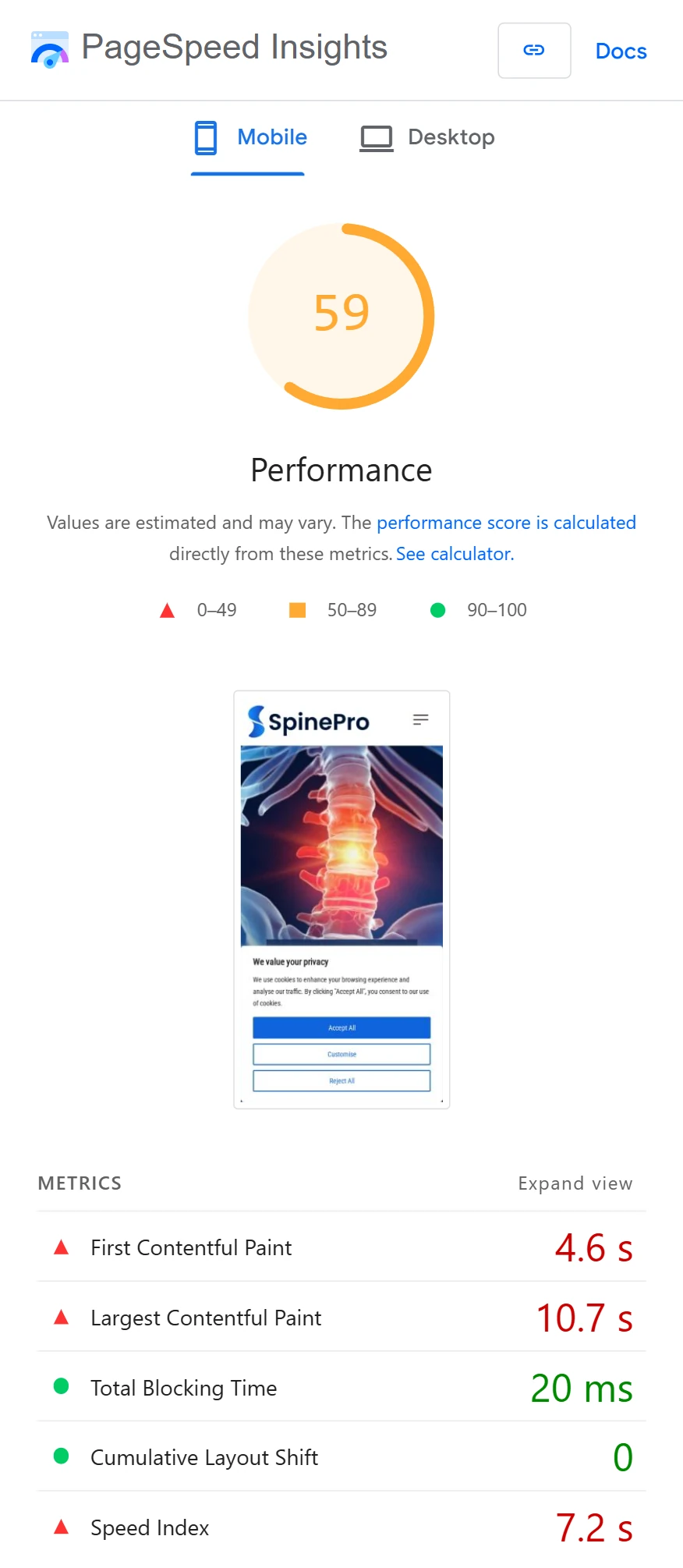
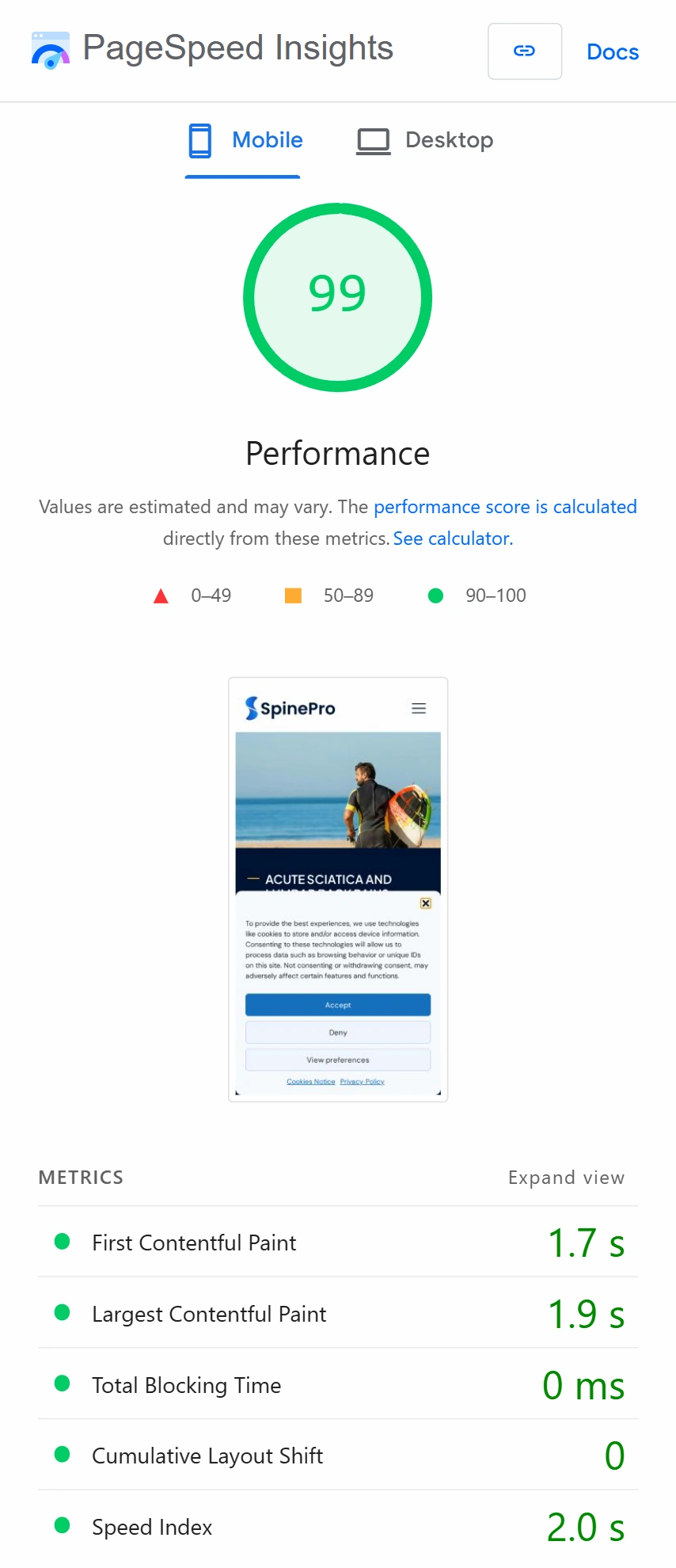
PageSpeed scores went increased to 99 on mobile and 100 on desktop, with real-world load times improving by 2-4x.
Before
After
Design and user experience
With that foundation in place, I worked through the site section by section. I redesigned the treatment comparison tables into something patients could actually scan: a proper HTML table on desktop that adapts to a card-based layout on mobile, rather than forcing users to scroll horizontally or squint at tiny text.
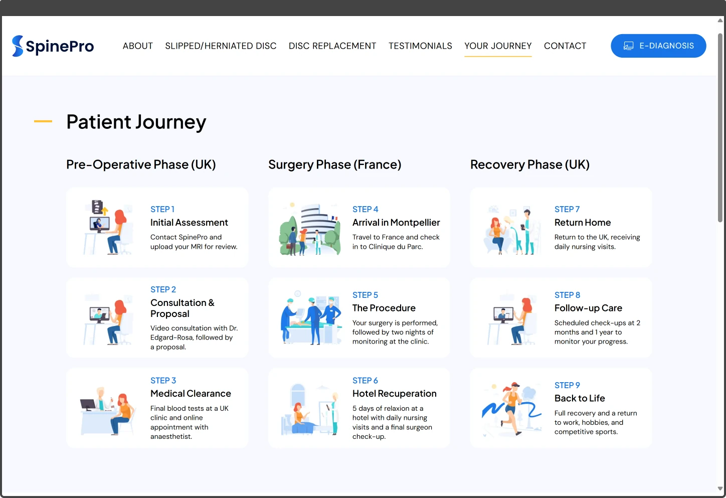
The 16-step patient journey was completely rethought: I worked with SpinePro to consolidate it into 9 clear steps organised by phase (pre-operative, surgery, recovery), presented as cards that work on any device.
I addressed accessibility issues throughout the site: improved colour contrast ratios; replaced placeholder-only form fields with proper visible labels (the e-diagnosis form had over a dozen fields where the only indication of what to enter was placeholder text that disappeared on focus); added alt text to images; and removed interaction patterns that exclude users on touch devices or with motor impairments.
Throughout, the goal was making information easier to find and understand. A medical decision like spinal surgery is already stressful; the website shouldn’t add to that by hiding information behind confusing interactions or presenting walls of text.
Before
After
Before
After
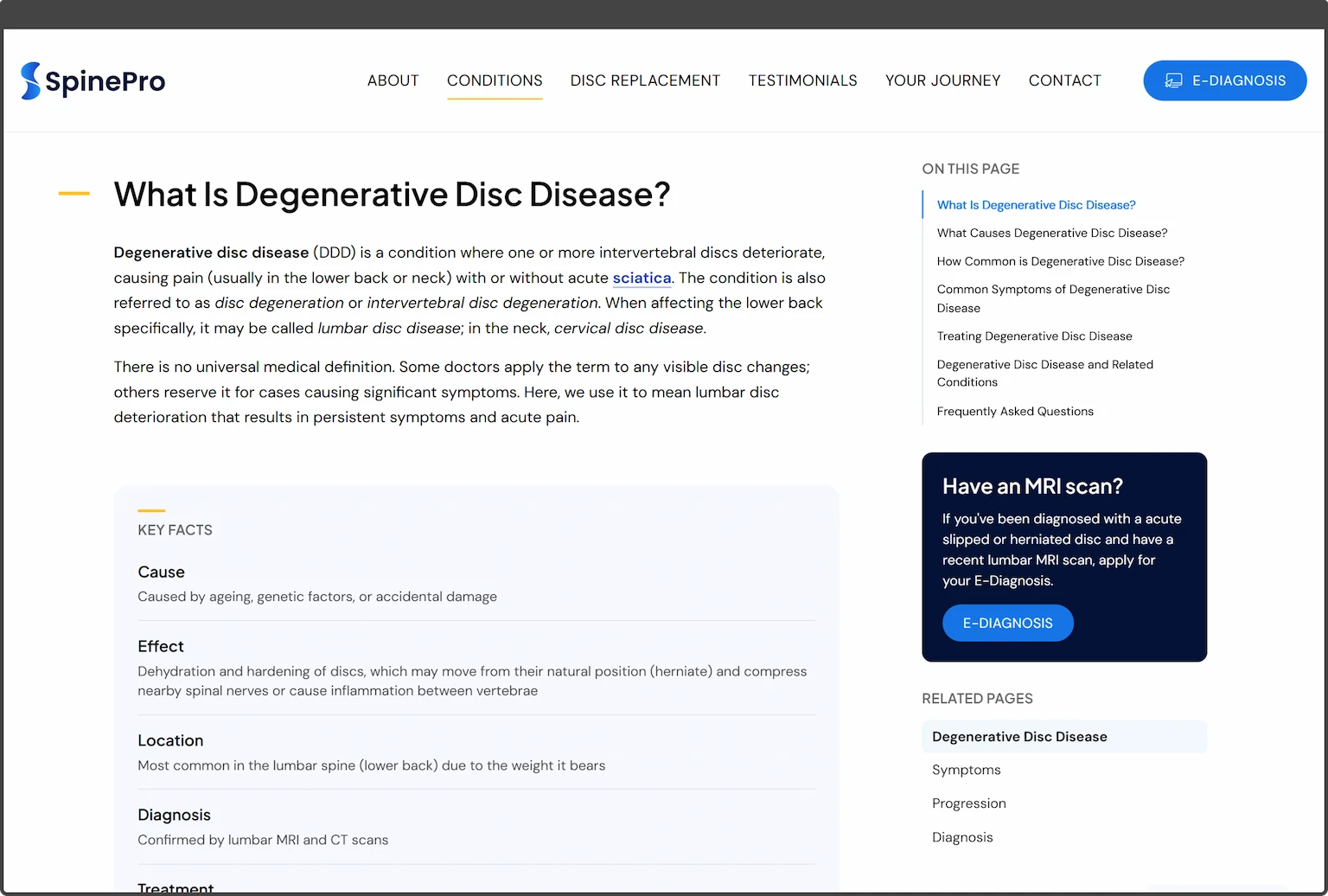
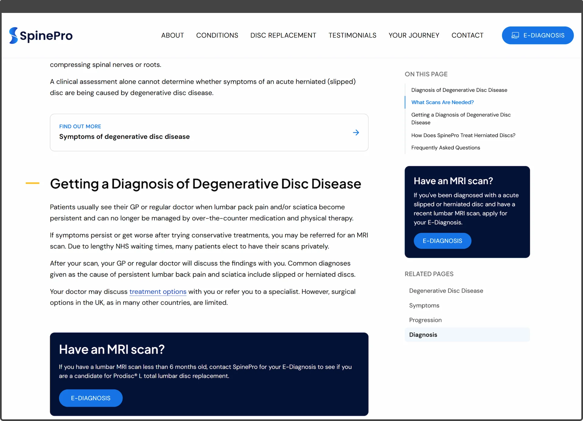
Condition pages and content system
With the core site rebuilt, the next step was giving SpinePro a way to publish detailed medical content that patients could actually follow.
People researching spinal conditions are often anxious, in pain, or both. They need clear, trustworthy information and not walls of text or pages that make it hard to find what they’re looking for. The previous site didn’t have structured informational content, so we were building from scratch.
I designed and built a flexible page template with a system of content blocks: introductory text, key facts summaries, image sections, contextual links to related information, and FAQ accordions. Each block serves a specific purpose and can be combined in whatever order suits the content.
My aims were to create a system that allowed future pages to be easily added, with design consistency throughout, and to give the pages a polished and trustworthy appearance, rather than a “wall of text”.
The pages include a table of contents that stays visible in a sticky sidebar as the reader scrolls on desktop. On mobile, this moves to a collapsible section at the top of the page so it’s accessible without taking up screen space. A persistent call-to-action for SpinePro’s e-diagnosis service sits alongside it, keeping the next step visible without interrupting the reading experience.
Project outcome
The new site launched on the morning of the 13th of February 2026, two weeks after we started. I will continue to work with SpinePro to extend, evolve, and maintain the website.
Throughout the project James proved to be extremely capable, responsive, knowledgeable and genuinely invested in the success of the project.
We have retained James to evolve the website and optimise SEO effectiveness and look forward to working with him in the months and years ahead.
I have no hesitation in wholeheartedly recommending James as he is a true professional by any measure.
James Barden
Operations Director
SpinePro